
Lorpon Labels leadership is always on the lookout for what’s working particularly well in the labels scene, so Jeff Sommer, VP Business Development and Murray Ditchburn, VP Sales, headed off to Ontario’s liquor store to see which spirits #OwnTheShelf. It’s a tough job, but somebody’s got to do it!
In part one of this two-part series, let’s check out Jeff’s selection:
What Jeff is looking for as he walks through the LCBO

Jeff Sommer, VP Business Development
I’m always on the look-out for items that pop. There’s a reason that big brands often adjust their packaging—so it doesn’t just blend into the shelf. Brands can differentiate themselves with colour, touch, and feel…anything that conveys premium or a sense of scarcity at a reasonable price for the average consumer. I’ll happily pay an extra 5 bucks for something that looks artisan, craft, premium, or has a personal touch to it.
Jeff selected 16 spirits that he feels #OwnTheShelf.
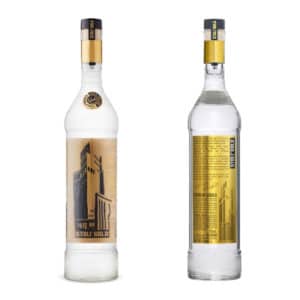
Number one
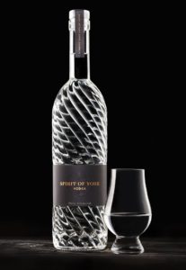 Spirit of York vodka
This unique bottle paired with the copper foil embossed black label immediately sets Spirit of York vodka apart from its competitors. In addition The elastitag around the neck underscores this product’s premium appearance.
Number two
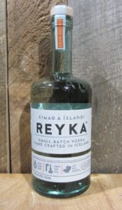 Reyka
Reyka
At a glance, the customer gets the brand’s vibe, intuiting that they’re looking at a small-batch, craft product. With a subtle background pattern and the scalloped diecut, these crisp, white labels offer ample information in a stylized—and stylish—way. Reyka is just the latest brand to use two labels to great effect.
Number three
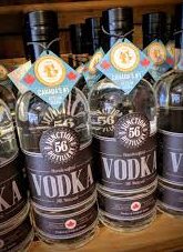 Junction 56 Distillery
Like the entry above, this vodka brand also uses two labels creating a very different appearance. The blacks and silvers, and the circular badge at the top, result in a classic, timeless look.
Number four
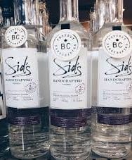 Sid’s
Sid’s
Another example of the striking appearance of two labels, Sid’s has taken the idea a step further by using contrasting white and maroon, creating a premium appearance. Not to mention, the hangar adds an extra touch.
Number five
Stoli Gold
As an extremely recognizable brand, Stolichnaya has a challenge to differentiate this gold medal-winning edition from the rest of its line. They’ve succeeded by producing a unique graphic on a clear, double-sided label so you can see it through the bottle. The embossed, metallic foil substrate is striking.
Number six
 Cirka
Cirka
With an evocative illustration, modern typography, and bold blocks of red and grey, Cirka catches the eye. Subtle touches, like the unique diecut and emboss on the brand name, round out a great-looking bottle.
Number seven
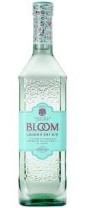 Bloom
Bloom
This is a great example of a brand that manages an alluring timelessness. Everything from the unique shape of the bottle to the diecut to the embossing on the word “Bloom” evokes a classic gin look, while the colour, a juniper blue, evokes the spirit itself.
Number eight
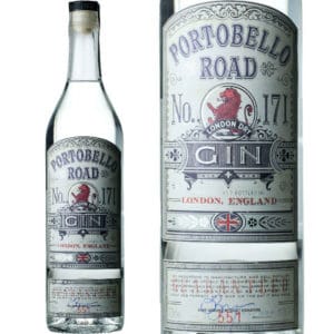 Portobello Road
Using two labels with variable content and numbering, Portobello Road wraps itself in the look of a small-batch, classic British gin.
Number nine
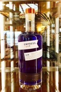 Empress
With a unique spiral wrap-around label, Empress manages to convey a lot with very little. This bottle has no embellishments, but it doesn’t need any. Simplicity at its best in this case.
Number ten
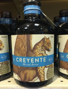 Creyente
This is a label that very much reflects the contents. Everything from the bottle’s unique shape to the textured paper to the high contrast graphics is evocative of Mexico. Creyente takes it one step further by personifying their brand with a hybrid beast—it’s a nod to the fact that the bottle contains a mix of two mezcals.
Number eleven
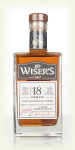
JP Wiser’s
This whiskey brand uses two labels in contrasting colours along with a signature and a seal to create a classic look. The square bottle adds a touch of modernity.
he use of colour (especially yellow), the strong red font and the bold, tactile image of the buck and bronco.
Number twelve
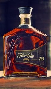 Flor de Cana
With rich colours and the expert use of foil, Flor de Cana manages to communicate that it is a premium offering. The non-tradition shapes of both the bottle and the label are surprisingly successful in hinting at the flavours within.
Number thirteen
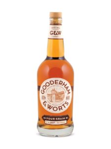 Gooderham & Worts
Everything from the font to the illustration to the shape of the top label is bold and eye-catching. The use of a much-smaller secondary label with blend number gives a small-batch impression.
Number fourteen
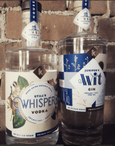
Kinsip Still’s Whisper Vodka and Juniper’s Wit Gin
With textured felt paper, the classic and intentional use of foil, unique neck label, and the overall detail in the artwork, it’s clear there’s a story being told.
Number fifteen
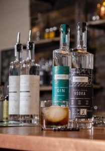 Crosscut Local Harvest Gin and Triple Grain Vodka
These spirits have the whole package—a great bottle and enchanting labels. Black paper presents challenges for printers with getting proper ink opacity, but the white has a slight texture, is bright, and jumps off the paper. We love the use of a tealish green colour stock on the gin label, and the copper foil makes it pop. We’re still hoping for this to hit the LCBO but it’s too good not to mention!
Number sixteen (honourable mention)
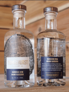 Yongehurst Distillery Harbour White Rum
The eggshell felt stock has a gritty, toothy texture which, along with the wood-grain illustration and signatures of the distiller, creates a true connection to the brand. Keep an eye out for this distillery’s other labels which use subtle and not-so subtle variations to differentiate their offerings.